Maa Paa Tattoo Designs: Ideas, Devanagari, Handwriting & Memorials
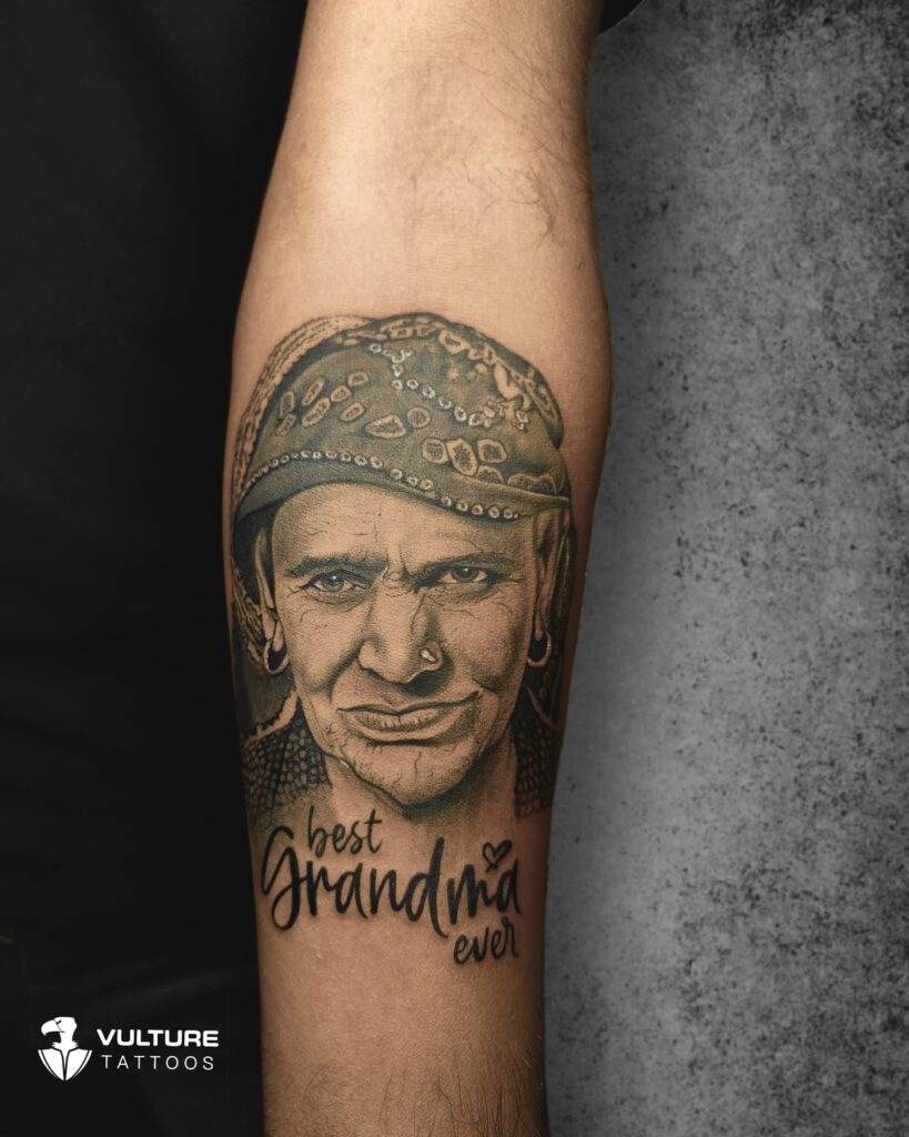
Of everything we tattoo, this is the one people cry over. Not from pain — from what it is. A maa paa tattoo is usually not about design at all. It is about carrying two people with you, and quite often about carrying someone who is no longer here.
That is exactly why it deserves more care than it usually gets. These are almost always text pieces, and text is the least forgiving thing you can put on skin: a wrong matra, a cramped font, a date in the wrong format, and the most meaningful tattoo you will ever get becomes the one you quietly cover up. If you are looking at maa paa tattoo designs, this guide covers the versions that work, how to get the Devanagari right, and how to build one that still reads clearly in thirty years. We are Vulture Tattoos, an appointment-only studio in Sector 47, Gurgaon.
Maa paa tattoo designs that work
- माँ पापा in Devanagari. The most requested version by far. Simple, direct, and it means more in the script your parents actually read. Needs correct matras and honest sizing — see the section below.
- Maa Paa in English script. Cursive or handwriting-style Roman lettering. Cleaner at small sizes and easier to place on a wrist or collarbone.
- With a crown. A small crown above “maa” or above both words. Enormously popular, and it works because it adds meaning without adding clutter.
- With a heartbeat line. An ECG line running through or under the text. Reads instantly, and it carries a different weight when one parent has passed.
- With an infinity symbol. The names woven into the infinity loop, or the symbol sitting between them. Our infinity tattoo designs guide covers how that shape ages.
- Their actual handwriting. Traced from a letter, a card, a signature, a note left on the fridge. This is the most powerful version of this tattoo and the one we most often recommend.
- With dates. Birth dates, or birth and passing dates. Roman numerals or standard figures, usually beneath the names.
- With Om or trishul. Devotional elements alongside the names, particularly common for memorial pieces. See our Om tattoo designs and trishul tattoo designs guides.
- Parents’ portraits. Black and grey realism of one or both parents, sometimes with the names beneath. The most ambitious version, and Ajay’s speciality — read our realism tattoo guide for how to judge portrait work.
- Feet or hands. Their footprints or a pair of hands, often paired with the names. Deeply personal and it works at modest size.
Getting the Devanagari right
This is the section that matters most, and the one that almost no studio page covers.
Devanagari is built on a continuous top line — the shirorekha — that runs across the whole word and holds it together, with vowel marks, the matras, sitting above and below the consonants. माँ carries a chandrabindu above it. Move a mark, break the top line in the wrong place, or crowd the letters and you have written something else, permanently.
- Write the exact text out yourself. Not a screenshot from Pinterest. Type or write the precise characters you want.
- Have it checked by someone who reads the script. A parent, a teacher, a cousin. Not a translation app — those produce convincing nonsense regularly.
- Size it honestly. Devanagari needs more vertical room than Roman text of the same length, because the matras above and below need clearance. This is the single most common mistake on wrist pieces.
- Read the stencil on your skin before we start. Out loud, slowly, in the mirror. It costs nothing and it is your last checkpoint.
Our full script tattoo guide for Gurgaon goes deeper into fonts, spacing and how lettering ages.
Handwriting replication — why we usually suggest it
If you can find something in their handwriting, use it. A signature at the bottom of a document, a birthday card, a note, a name written inside a school book. Anything.
The reason is simple. A font is a font — thousands of people have the same one. Your mother’s handwriting is hers alone, with all its quirks: the way she loops a letter, where she presses harder, the slight slant. Twenty years from now that is the thing that will still stop you when you look down at your arm.
- Bring the sharpest photo or scan you can. Better source, better tattoo. Flat lighting, no shadow across the page.
- We trace the actual hand, not approximate it. The quirks are the whole point and we keep them.
- We adjust only what would not survive. Strokes too fine to hold in skin get the minimum thickening needed, and nothing else changes.
Memorial pieces — a few honest words
A large share of these tattoos are for a parent who has passed. If that is you, two things are worth saying plainly.
There is no rush. Grief moves, and so does what you want to carry. People sometimes book a memorial tattoo within days of a loss and later wish they had waited, not because they regret honouring the person but because the design they chose belonged to the very worst week. Nobody at this studio will push you to book faster.
Check the dates twice, then once more. Memorial dates are the single most emotionally costly thing to get wrong, and grief makes everyone careless with detail. Confirm the format too — 03/05 is two different days depending on where you learned to write dates. If you are using Roman numerals, check the subtractive rule: IX and XI are one small error apart.
We would far rather delay your session by a week than put a wrong date on you.
Where it sits best
- Inner forearm. The best all-round placement. Flat, low friction, easy for you to see, and it ages well. Room for names, dates and a small element.
- Collarbone. Elegant, and the bone gives a natural line for text to follow.
- Chest, over the heart. The most obvious meaning, and there is space to size it properly.
- Inner bicep. Private, low sun exposure, good for something you want to keep for yourself.
- Upper back or shoulder blade. Flat and protected, ideal if you want portraits or a larger composition.
- Wrist. Very popular, and the one to be careful with — high friction, high sun, and the least space for Devanagari matras. Keep wrist versions simple and not too fine.
Size and how it ages
Ink spreads slightly in living skin over the years. On bold work you never notice. On lettering it is the difference between a word and a blur, and text is what this tattoo is made of.
- Generous spacing between letters and lines. The single biggest factor in whether text still reads in fifteen years.
- Consistent stroke weight, not hairline. Strokes so fine they are barely visible fresh will be genuinely invisible later.
- Honest size for Devanagari. The matras need clearance. A cramped माँ पापा closes into a dark smudge faster than any Roman version of the same words.
- Fewer elements. Names, one symbol, maybe dates. Adding a crown, a heartbeat, an infinity, flowers and a quote to a small wrist piece is how it becomes unreadable.
When we suggest going larger or dropping one element, that is us protecting a tattoo you specifically cannot afford to have go wrong.
Does it hurt?
Same as any tattoo of that size in that place — text changes nothing. The outer forearm, upper arm and inner bicep are comfortable. Collarbone, sternum, ribs and the inner wrist are sharper. Most maa paa pieces are short sessions because there is not much surface to cover; portrait versions are considerably longer.
Ready to talk it through? Call or WhatsApp us on +91 96676 14250 or message us on WhatsApp. Bring the handwriting if you have it.
Healing and aftercare, with a Gurgaon twist
- Keep the initial wrap on for as long as your artist advises, then wash gently with lukewarm water and a mild fragrance-free soap.
- Pat dry, never rub. Rubbing fresh linework pulls pigment out of thin strokes.
- Apply a thin layer of the recommended balm. Thin is the word.
- Do not pick or scratch. A picked scab in the middle of a letter leaves a gap that needs touching up, and touch-ups on fine text are fiddly.
- No swimming, saunas, gym sweat or soaking for the first two to three weeks.
- Keep it moisturised well past the peeling stage.
Forearm and wrist placements catch Gurgaon sun daily. UV softens black over years, and on thin lettering that shows as the strokes losing their edges. Once healed, use SPF 30 minimum — 50 is better — every time it is exposed, and cover it on long outdoor days. Our full tattoo aftercare guide for Gurgaon covers each stage.
Why the artist matters here
There is no shading to hide behind on a text tattoo. Every stroke is the tattoo. Baseline drift, uneven letter spacing, inconsistent weight — all of it is visible immediately, and on a piece this personal it will bother you every single day.
A skilled artist holds stroke weight steady across a whole word, spaces letters so they still read in a decade, lays the line so it follows the curve of your arm rather than fighting it, and works at the right depth so fine strokes stay crisp without blowing out. With Devanagari they also keep the shirorekha continuous and the matras clear.
Ronny specialises in fine-line, botanical, script and geometric work, so lettering, Devanagari and handwriting replication sit with him. Ajay handles realism, devotional, portrait and cover-up work, which covers parents’ portraits and memorial compositions. Our page on the tattoo artists in Gurgaon introduces both.
Every tattoo is done with single-use sterile needles opened in front of you, in an appointment-only studio, which is part of why our clients have left more than 270 five-star Google reviews.
How it comes together with us
- Consultation. You bring the words, the handwriting if you have it, and any dates. We talk about placement, size and what belongs in the piece.
- Verification. Spelling, matras, dates and formats — checked, then checked again by you.
- Design. Drawn to your text and your placement, spaced and weighted for how it will age. You see it before any needle touches you.
- A written quote at consultation. Clear, before anything begins. Our tattoo cost guide for Gurgaon explains what shapes it.
- Aftercare and touch-ups. A clear plan, and we are on WhatsApp while it heals.
The local angle: why book in Sector 47
Vulture Tattoos sits at Shop F-04, Spaze Boulevard, Malibu Towne, Sector 47, Gurugram, easy to reach from across Gurgaon, DLF, Sohna Road, Golf Course Road and South Delhi. Appointment-only matters more than usual for this one — a memorial piece is not something you want to sit through with walk-in traffic moving around you. The studio stays quiet, and you get the time to sit with the stencil before you commit.
Book your maa paa tattoo: call or WhatsApp +91 96676 14250 to start with a consultation.
See our work and get in touch
Line quality is everything on a text piece, so browse our recent work on Instagram at @vulture_tattooz, read more about the studio at Vulture Tattoos, or reach out through our contact page. When you are ready, call or WhatsApp us on +91 96676 14250 and we will help you plan maa paa tattoo designs that stay clear and stay right.
Frequently Asked Questions
Should I get maa paa in Hindi or English?
Devanagari means more to most people, because it is the script your parents actually read, and माँ पापा carries a weight the Roman version does not. The trade-off is size: Devanagari needs more vertical room for the matras above and below the top line, so it does not shrink onto a small wrist as neatly. English script is cleaner at small sizes. We will show you both at the consultation before you decide.
Can you copy my parent’s handwriting?
Yes, and we usually recommend it. Bring the clearest photo or scan you can of the original — a letter, a card, a signature. We trace the actual hand rather than approximating it with a font, keeping the quirks that make it theirs, and thicken only the strokes that are too fine to survive as a tattoo. Nothing else gets changed.
How small can a maa paa tattoo be?
Smaller in English than in Devanagari. The limit is set by spacing, not by the words: text needs generous gaps between letters and lines or it closes up as ink settles over the years. Devanagari needs more height still, because the matras need clearance. We give an honest minimum size at the consultation rather than letting you discover it at a touch-up.
What can I add to a maa paa tattoo?
A crown, a heartbeat line, an infinity symbol, dates, Om or a trishul, or their footprints. The advice is to pick one, not four — the most common regret on these pieces is clutter in too small a space. If you want several elements, the answer is usually a slightly larger piece rather than a busier small one.
Is it okay to get a memorial tattoo soon after losing a parent?
There is no rule, and plenty of people are glad they did it early. What we would gently say is that grief moves, and some people later find the design they chose belonged to the very worst week rather than to the person. We will never push you to book faster, and we would rather you took another month and were certain.
What should I check before the session?
Spelling, character by character, verified by someone who reads the script. Dates, including the format — 03/05 means two different days depending on where you learned to write dates. If you are using Roman numerals, check the subtractive rule, because IX and XI are one small error apart. Then read the stencil on your skin, out loud, before we start.
Do text tattoos blur over time?
Thin lettering with tight spacing can, yes — ink spreads slightly in skin over years and fine strokes have the least margin. The fix is in the design rather than the aftercare: generous spacing, consistent stroke weight instead of hairline, and honest size for the script. Built that way, a text piece reads clearly for decades.
How do I book and how much will it cost?
Booking is by appointment. Call or WhatsApp us on +91 96676 14250 to arrange a consultation, where we go through the wording, script, placement and size, and give you a clear written quote once the details are settled. Pricing depends on size, detail and time, so we quote in person rather than online.